
Client
Medispring
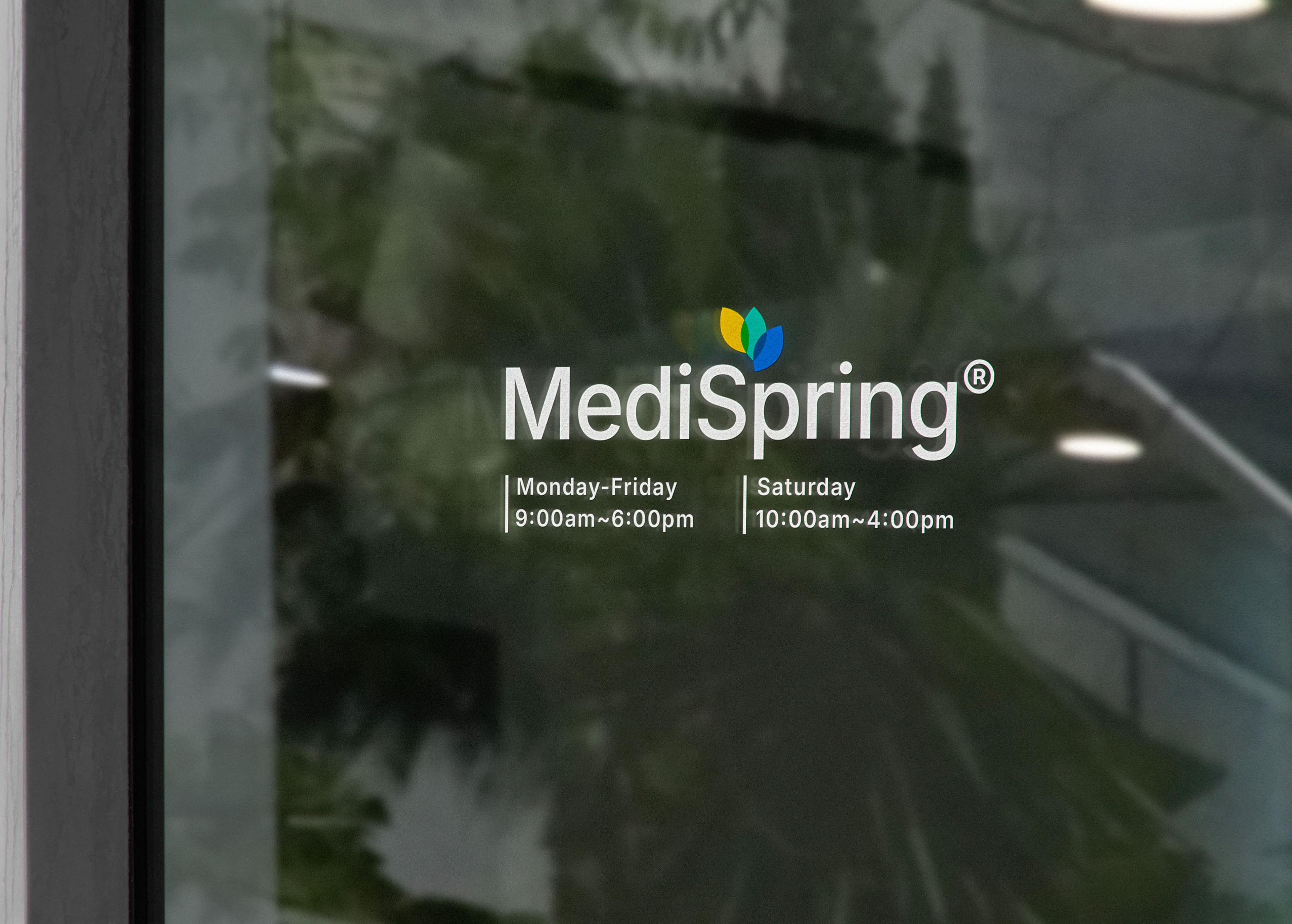
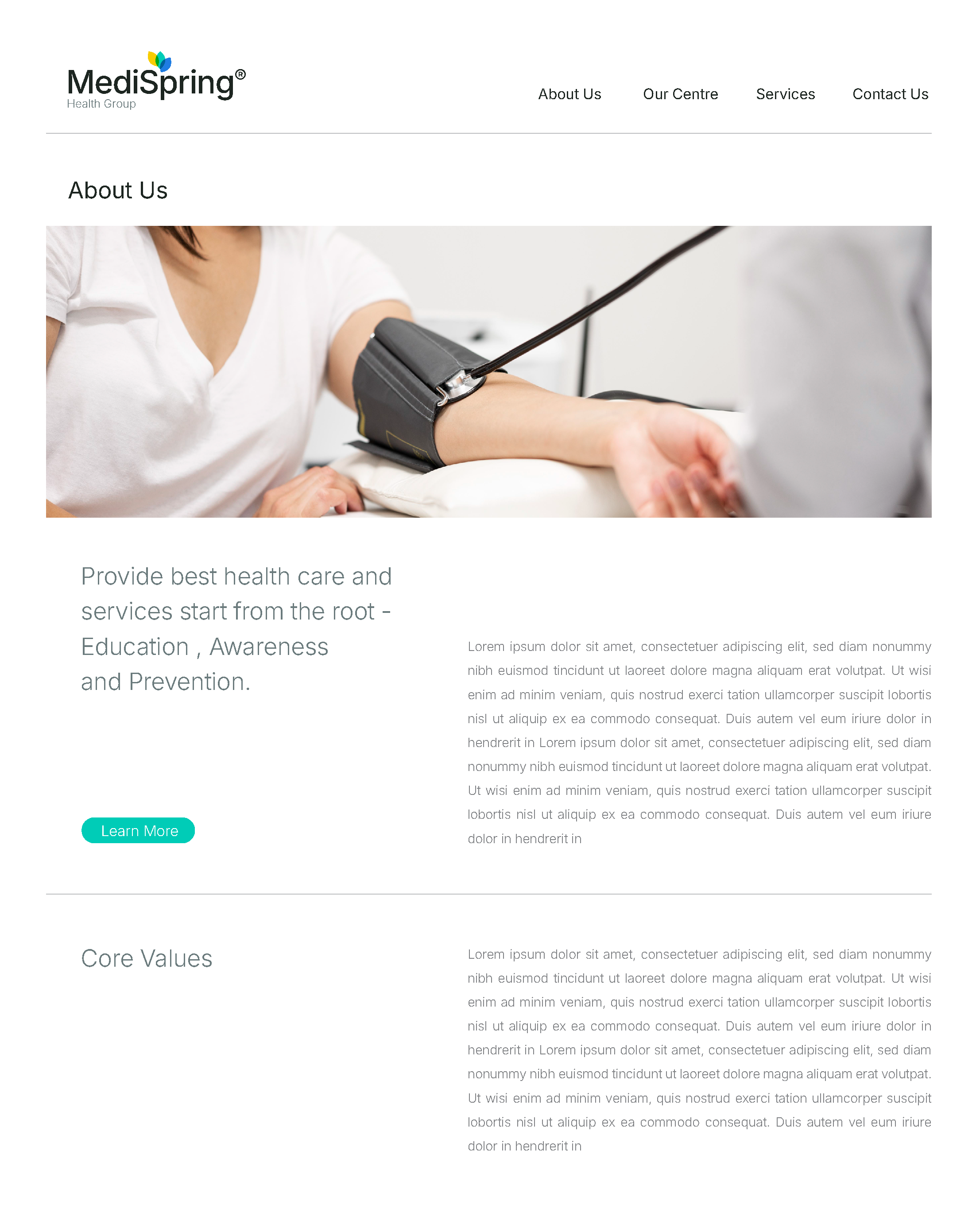
MediSpring
Rebranding Project
MediSpring embarked on a rebranding journey to build a cohesive brand system that could be consistently applied across its companies and outlets. The previous logo was difficult to adapt for modern applications and limited the brand’s flexibility in design. With today’s younger audience expecting professionalism paired with contemporary aesthetics, MediSpring needed an identity that feels fresh, relevant, and versatile. The new branding not only streamlines visual expression but also equips the company with a scalable system to grow and evolve with confidence.
Brandfolks // 2024
Logo & Branding Design
Designer: Yu Ying Koo
Art Director: Hwa Win See, Sin Kai Goh

Brand Identity
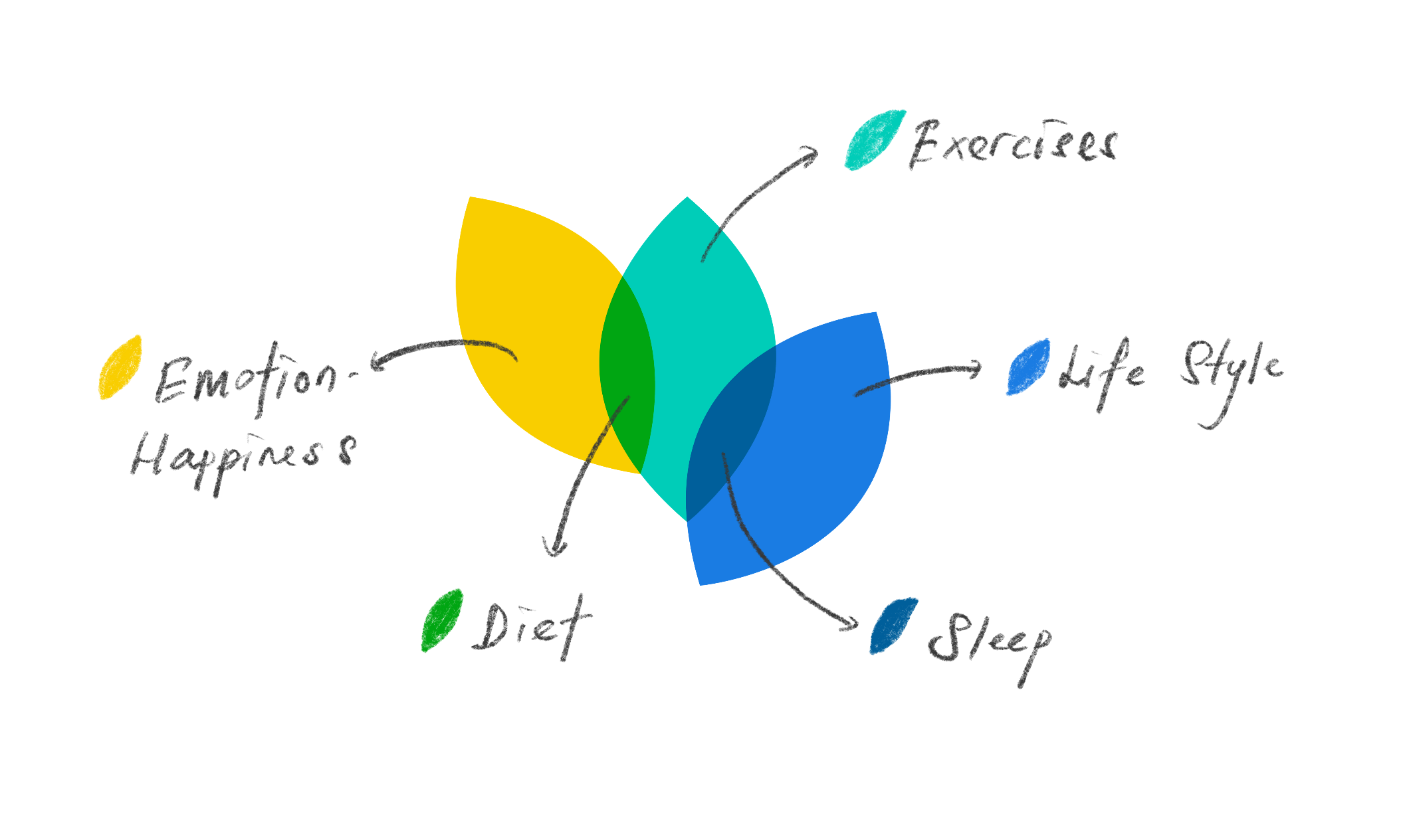
Five Pillars of Health
As part of the rebranding project, we created a more holistic, contemporary, and minimal visual identity for MediSpring. The new logo is composed of three overlapping leaves, subtly revealing the form of five leaves to represent the brand’s five pillars of health: Emotion & Happiness, Exercise, Diet, Sleep, and Lifestyle. In contrast to the previous complex “tree of life” symbol, the refined design conveys clarity, modern simplicity, and accessibility-while continuing to embody MediSpring’s essence of health, balance, and natural vitality.
2423 C
116 C
2239 C
2727 C
3015 C
3 C


Brand Expression
MediSpring’s brand expression is rooted in the belief of health and professionalism. We use vibrant and pristine colors to create a lively and refreshing visual atmosphere, while our tone of voice remains professional and reassuring, instilling confidence and peace of mind in our audience. From packaging design and store environments to social media communication, MediSpring consistently conveys one core message: health is not only about treatment, but about the principle that prevention is better than cure.

Do It Right.
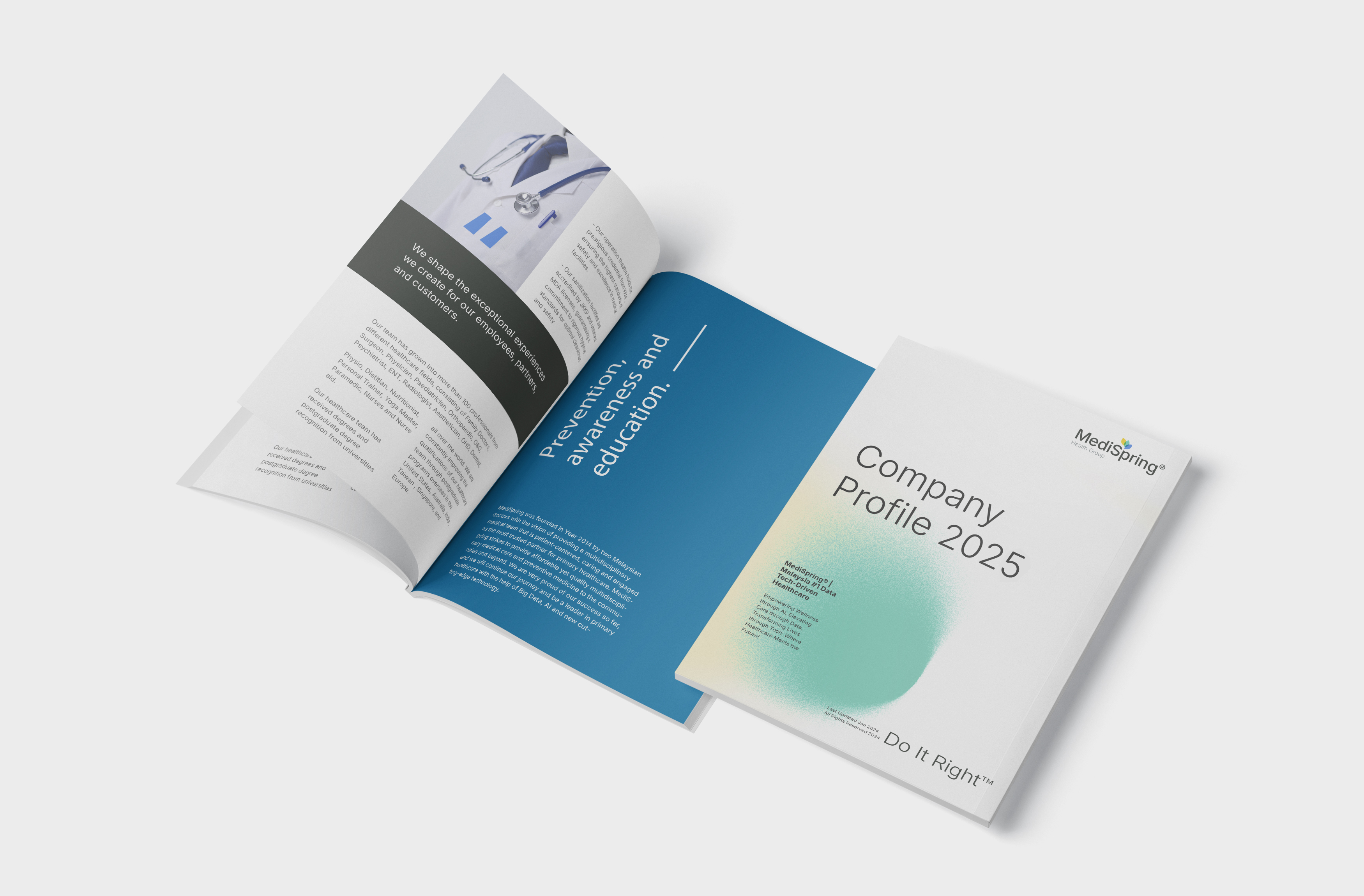
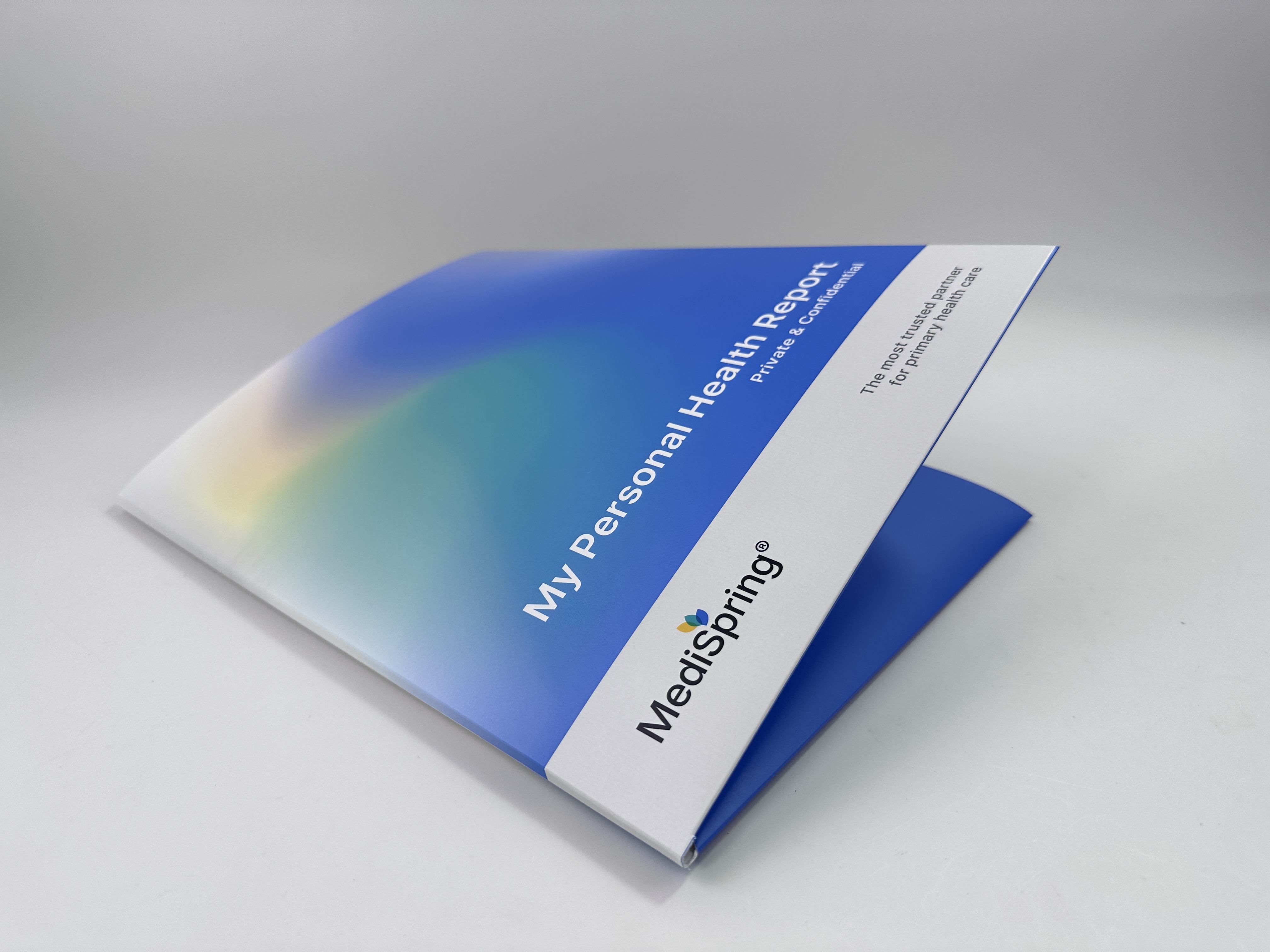
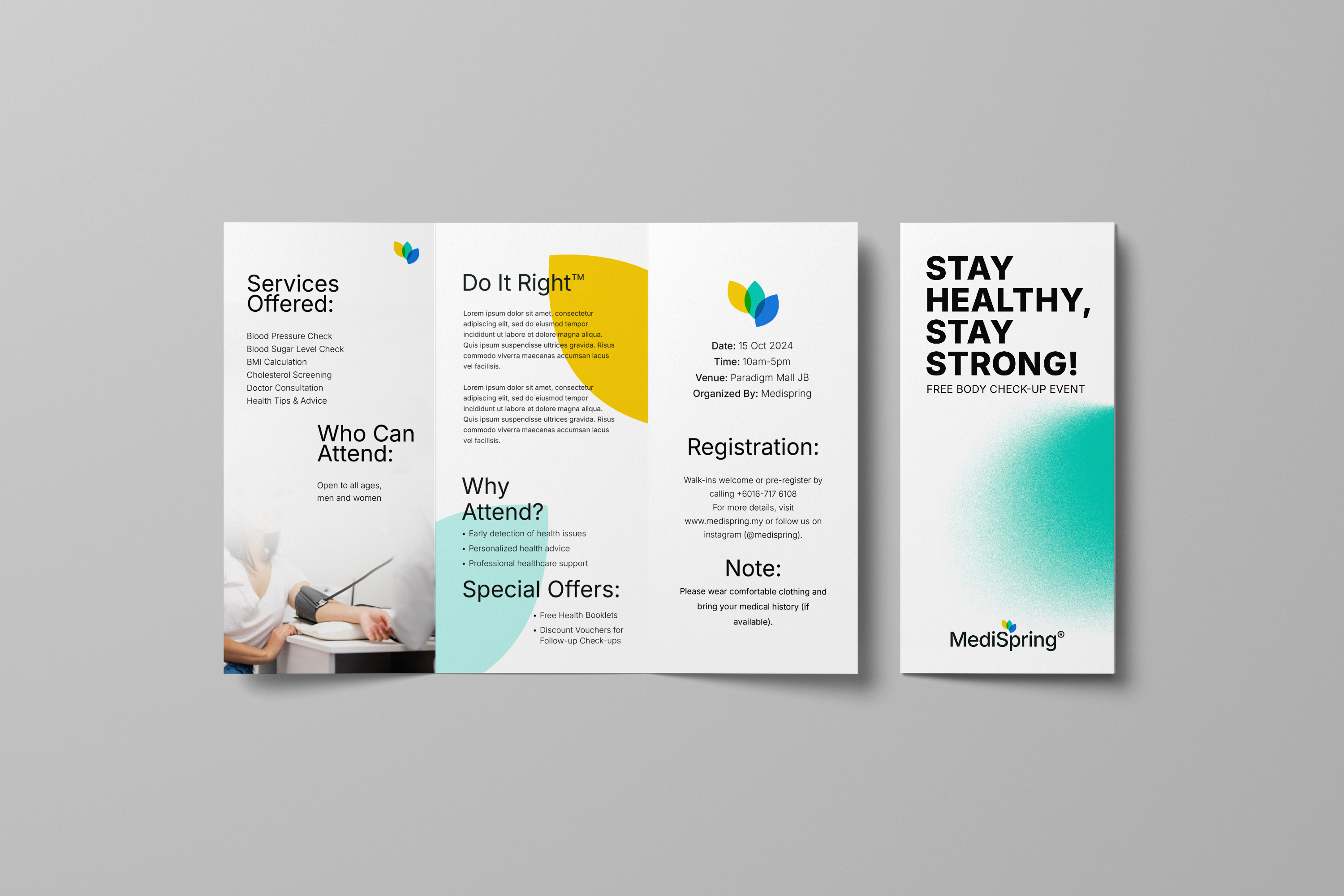


A Unified Identity Across
Every Touchpoint
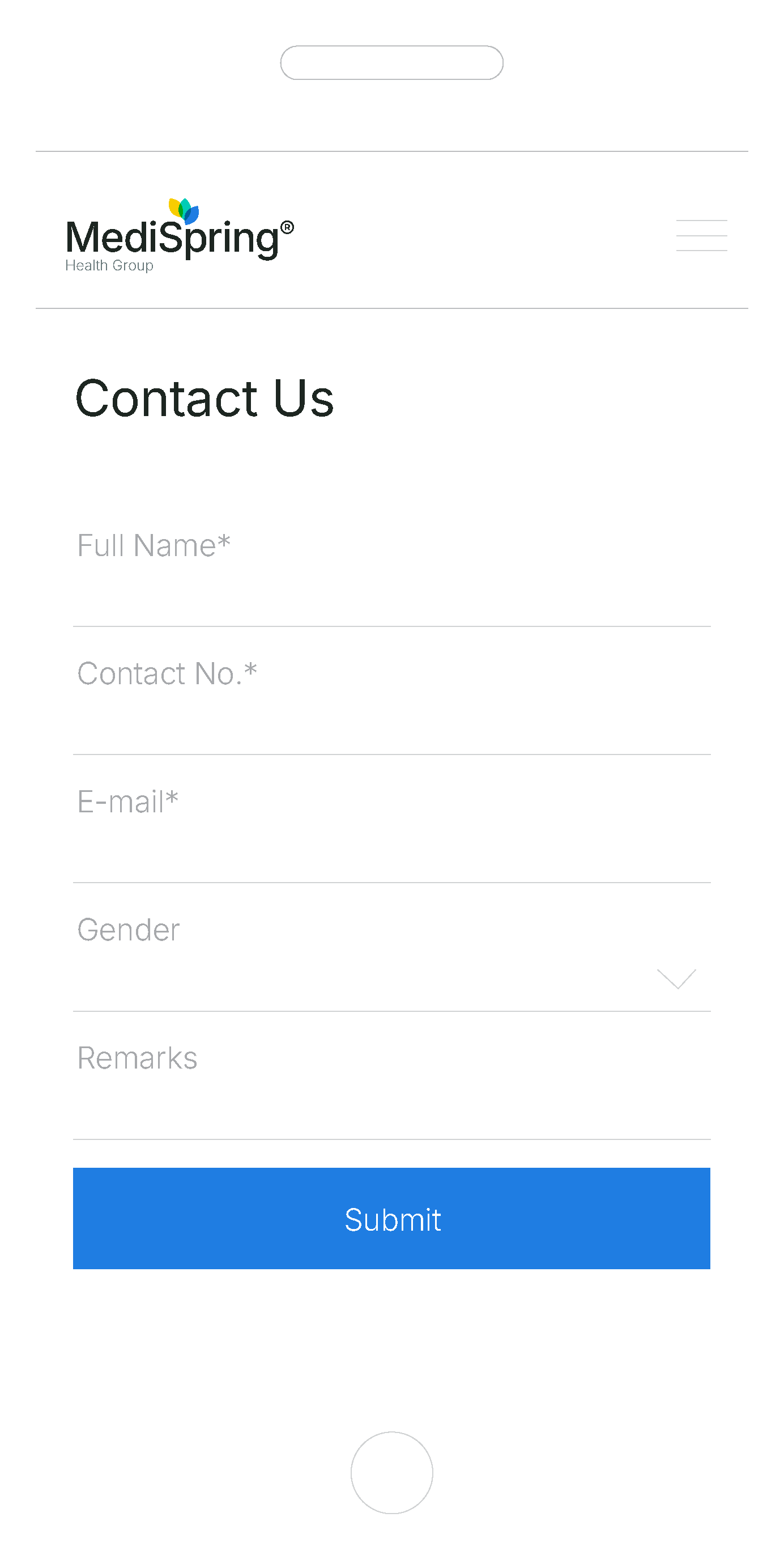
The new MediSpring brand system was designed with adaptability at its core. Its simplified visual identity allows seamless application across packaging, products, retail spaces, and digital platforms-creating a unified look and feel at every touchpoint. By establishing clear visual consistency, the system strengthens brand recognition and leaves a lasting impression. This flexibility ensures that no matter where the brand appears, MediSpring communicates the same values of professionalism, vitality, and trust.

“Working with Brandfolks has been transformative for our healthcare company. They
truly understood our mission and helped us elevate our brand to a whole new level,
clearer, stronger, and more impactful.
We now feel confident that our brand reflects the care and trust we provide every day. ”
Dr. James
Director of MediSpring Group


We are thrilled to celebrate our client, MediSpring Health Group Sdn. Bhd., for winning the Gold Award for Best Use of Technology at the Star Outstanding Business Awards (SOBA) 2024, and being featured in The Star newspaper.
As their exclusive co-branded design partner, we had the privilege of leading MediSpring’s rebranding journey - from redefining their brand strategy and visual identity, to crafting a cohesive brand language that reflects their innovation in healthcare technology.
This recognition not only celebrates MediSpring’s commitment to digital transformation, but also embodies the power of strategic branding and design in shaping trust, credibility, and growth.
We’re proud to stand behind a brand that continues to set new standards in healthcare excellence.
